During the first months of the COVID lock down, Globant approached me with a job opportunity. To be able to join their team, I had to complete a design challenge in 5 days—reimagine in-store payments in the retail experience. Having worked in clothing stores while in university, I decided to focus on them.
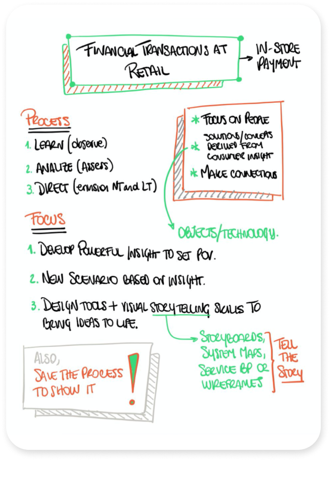
Expected outcomes
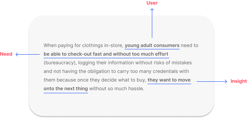
A powerful insight to frame a point of view for the solution.
A new scenario based on that insight.
A visual description of the right idea(s).
Notes from kick-off.
Challenge
Approach and define an ambiguous problem statement by focusing on people and incorporating concepts or solutions derived from consumer insight.
The design process allowed me to discover the main pain points of the current experience and turn them into opportunities. This enabled me to define an MVP and ideate possible evolutions. Lastly, I was offered a position as a Sr. Service Designer for this work.
Normally, I would kick-off any project by interviewing the main stakeholders. But because of quarantine, I decided to start off with secondary research to achieve the following:
Define the business and technical requirements for payment experiences.
Discover and understand what retail transactions entail.
Conclusions
After reading and analyzing the data found online*, I synthesized the findings and drew conclusions.
Clarity
The experience should provide clarity of place, moment and actors involved. It can’t be done wherever in the store, in no particular.
Traceability
The in-store payment experience should be able to be traced back and accounted for; therefore, it should be recorded.
Exchange & transformation
Also, it should include an exchange and a transformation of ownership.
To design a solution that respected the technical requirements previously stated, it was necessary to map out who were the direct and indirect stakeholders enabling the success of the service moment.
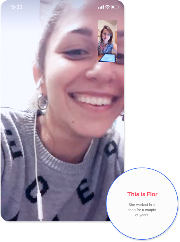
In order to do that, I interviewed Florencia, a young woman -and a childhood friend- who worked as a salesperson and cashier in a clothing store for over three years.
Prioritization
of stakeholders
Frontstage
1º Client 2º Salesperson/Cashier 3º Supervisor (could be present or not)
Backstage
4º Systems Department / Information Systems
Behind the scenes
5º Bank (affiliations) 6º Company/firm’s processes
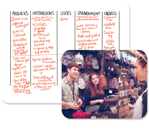
Primary Research
The methods selected were qualitative (non-participant observations and in depth-interviews) and inductive. This meant that the main objective was to explore, find patterns and build a hypothesis in the form of a prototype.
Non participant observation
Objectives
Get familiar with the experience.
Define proto-moments.
Generate research questions for interviews.
Notes I took as I conducted the observation.
Process
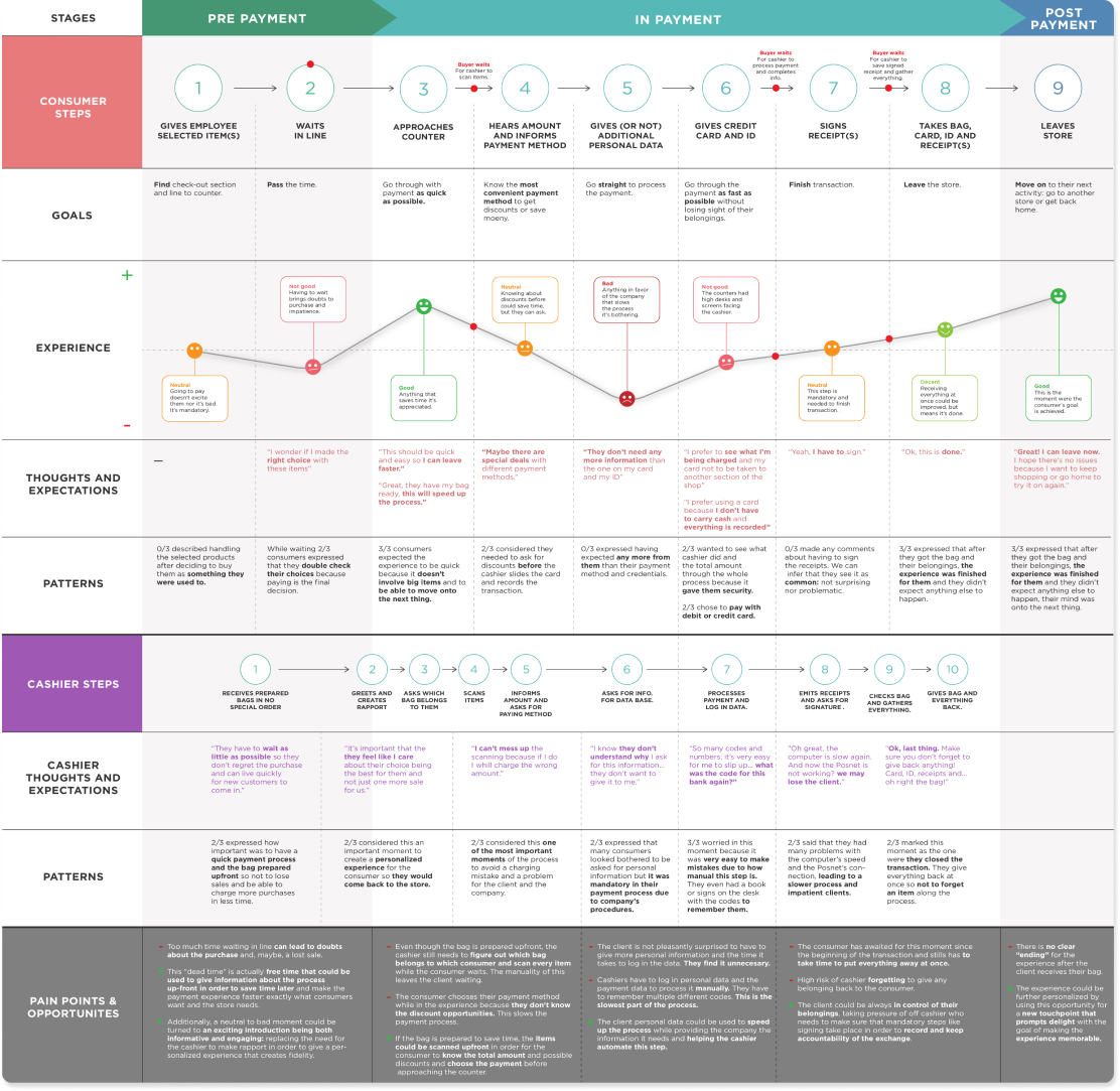
Because I was locked up at home, I decided to look at the experience through online videos. The situations depicted in them are not 100% real, but they give a general picture for how the experience is structured and what basic actions, interactions and objects are involved.
Proto-journey and general observations
With this, I created proto-journeys to draw findings and conclusions that would structure my interview script.
1
Prepayment
Duration depends on the type of store.
There may be a line.
Customer usually waits passively.
2
Payment
The client adopts a passive role whereas the employee has an active role.
Personal data and belongings may be requested from the client.
3
Post-payment
The customer waits again after payment is finished to receive their item(s) and belongings.
There are no more touchpoints after the payment is finished.
Main insight
The in-store payment experience is started by the customer but is, overall, an employee dominated experience. The employee carries out the process.
Seed for ideation
How might we go from a customer-passive role to a costumer-active role, letting the employee focus on connection and the customer take back control of the process?
Primary Research
User Interviews
Locating the macro moments of the experience allowed me to structure the interview questions, the interview script and provided me with a logic through which to process and synthesize the data.
Objectives
Discover which moments the user perceive.
Understand their relationship with the environment.
Discover their motivations, frustrations, needs and goals.
The interviews were conducted via video chat.
Participants
I proceeded to do 6 in-depth interviews, 3 with participants that fit the customer profile and 3 with participants who had worked as cashiers.
User sample
Women from ages 23 to 28 y/o who made a purchase in the last 6 months or worked in clothing stores for more than 6 months.
Analysis, debriefing and findings
To analyze the data, I reviewed my notes and used the macro-moments to structure my debriefing. I positioned each participant’s observation sequentially which allowed me to find micro-moments as well.
Main findings
Within each moment I found patterns that I summarized into conclusions.
Seed for ideation
How might we reconcile the customer’s need for speed and the employee’s need for accuracy and rapport?
Definition
Artifacts
To translate the findings into design definitions, I took all the gathered data and visualized it through the aid of two ideation artifacts: an experience map and proto-personas.
Experience map
Proto-personas
Moments’ opportunities
Through the analysis of the main pain points, I enlisted what could be improved in each of the experience’s macro-moments.
1
Prepayment
While the consumer waits in line they may regret their purchase.
Customers are not engaged and/or informed about details that could save them time during payment.
2
Payment
The cashier needs to figure out which bag belongs to each customer.
The consumer doesn’t know the total amount and available discounts beforehand.
The costumer doesn’t see the value in giving their data for the company’s database which the cashier has to input manually.
3
Post-payment
The customer has the task to put everything away, blocking the turn for the next client and slowing the line.
There’s a risk the cashier may forget to give all the customer’s belongings back.
The experience doesn’t have a clear ending without any last touchpoint nor a way to stay connected with the customer.
Experience principles
After visualizing the experience’s moments, steps, pain points and opportunities as well as the user’s needs and main challenges, I went through yet another synthesizing process (got to love those) to create the experience principles.
Have all contexts in mind
The experience should be scalable to different volumes of clients.
Put them in charge
The experience should be customer-dominated.
Make it fast
The experience should be as short and fast as possible.
Don’t make me ask
The experience should be anticipatory giving the customer the info they need to begin payment.
Keep it simple
Every process should be assisted, simple, centralized and automated when possible.
Engage with me, just enough
The experience should allow the minimum personalization required to foster fidelity.
Facilitate my payment
The experience should orchestrate the actions of every actor to make the payment seamless.
Don’t forget about me
The experience should be able to be traced back and accounted for. Therefore, it should be recorded.
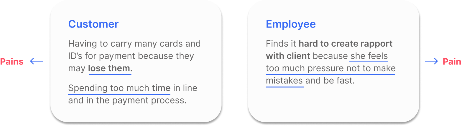
Solution POVs
Finally, I developed meaningful and actionable problem statements to move onto the ideation phase in a goal oriented manner.
Customer
Employee
Ideation
Benchmark
Before crafting a solution hypothesis, mapping out current solutions and trends was necessary in order to know which technology is available as well as which experiences/interactions are users already used to or veering to.
Product and services
Trends and studies
Solution hypothesis
To build the solution hypothesis, I decided to develop a proposed solution statement.
Hypothesis
We believe that by
Asking customers to download app and sync it with their email;
Allowing customers to scan their own items with their phones;
Inform them of total amount, discounts and ask for payment method after scanning;
Allowing them to process the payment with the app with a quick and easy (no manually information entry) card and credential system while employee (previous ‘cashier’) prepares their bag/they wait in line for bag to get prepared;
Success criteria
We’ll be able to
Get costumers data by giving them real value in return: a better payment experience;
Allow costumer to trace their expenses;
Create fidelity and engagement by knowing consumers shopping preferences;
Upsell by recommending new items through digital touchpoints;
Allow users to choose their payment method successfully depending on discounts, promotions or possibilities;
Diminish time waiting in line and avoid delays;
Prevent manual mistakes from cashiers and allow them to focus on preparing the bag and creating rapport;
Prototype
Rough prototyping
Drawing closer to the 5th day deadline, one last challenge remained. How to prototype the experience for testing? How to remotely test it in an effective way?
Moment 1/13. The annotations were taken during testing.
I focus on the beginning (entering the checkout area and beginning the new experience) and the transaction because they were the key moments of the service.
Proposed task flow
Guerrilla testing
I tested the rough prototype remotely with 3 users, 2 of them were previous interview participants.
Part of the observation sheet I used for the remote tests.
Patterns for revisions
There are some highlights of the results I got from testing the idea with users.
They thought that was it
3/3 didn’t find it clear that this moment is just to download app and get in line to proceed with payment while waiting in line.
Moment 2/13: downloads app + signs in
A confusing beginning
3/3 got confused by the totem being interactive thinking that the payment would be done there without getting into another line.
Keep it simple
3/3 didn’t expect any kind of onboarding because they don’t need it.
Spam adverse
3/3 chose to link the email that they don’t use very often not to get any sort of spam email.
Moment 2/13: downloads app + signs in
Between moments 5 and 6: choosing payment and scanning cards.
I just want to pay
3/3 didn’t find value in seeing deals because they believe that it could be informed during payment.
Also, “deals” sound like promotions to upsell and bother the payment experience.
Key finding
The beginning sets the expectations
The most important moment is the beginning because it sets up the expectations for the rest of the interactions. If this moment fails, the experience fails.
Implementation
Storyboarding
In order to visually tell the story of the proposed solution hypothesis, I decided to create a storyboard to encapsulate the main moments of the story, the user’s context and thoughts and the artifacts necessary for a successful service delivery.
Sketching
Firstly, I sketched out the storyboard idea to decide how I would tell the story. Because of the omnichannelity of the proposed solution, I decided to visualize not only the user’s key moments but also the digital interactions they would have with the app with medium-fi wireframes.
Experience
After dusting off my UI skills along with my limited (but useful!) knowledge of procreate, I illustrated the iterated solution creating an experience storyboard through illustrations and medium-fi wireframes.
After understanding the customer’s main pain points I reimagined the payment process by proposing a hybrid experience that could “use” the time waiting in line to speed things up. I decided not to get rid of the line in this first version because the items had security tags that would still have to be removed before the customer leaves, therefore, making them wait again.
Pre-payment
→
Finishes choosing item
Juliana has a party tonight and came to the shopping mall to buy something to wear. After spending one hour looking and trying on things, she’s ready to pay.
Experience principle
Make it fast
Approaches line
There is a long line. If she has to wait too much time she starts doubting her purchase. She’s about to return her shirt when she sees a sign right next to her.
Experience principle
Have all contexts in mind
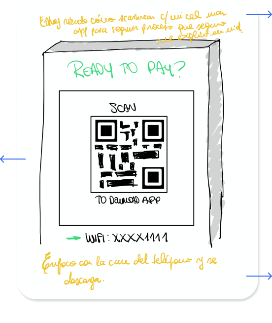
Finds Totem with QR code
At first, she was suspicious: how waiting in line could be turned into something good? But hey, she had to wait in line nevertheless, she might as well try it.
Experience principle
Put them in charge
Scans Totem and gets the app
She scans the QR code to get the app and starts her payment process. The store gave her a tote to carry the items so her hands are free to user her phone.
Experience principle
Keep it simple
Payment
→
Starts payment
After scanning her items’ price tags, she taps ‘proceed to payment’. Starting the payment while the line is getting shorter -and her turn closer- make her a little nervous. What if she’s not finished, and they ask her to prepare her bag? Luckily, the system answers her questions.
Experience principle
Don’t make me ask
Starts checkout process
After reading that she can still finish her payment while her bag is being prepared, she’s ready to start. She chooses her credit card and scans it quickly. After scanning her card, she makes the same procedure to scan her ID.
Experience principle
Facilitate my payment
Finishes payment
ID scanned! She’s getting closer to the counter now. She can’t believe the items will be already paid for when she gets her bag prepared. Ok, last step. Total amount, card… save card? It sounds convenient. Also, it could only be used with a password. Ok, let’s do it.
Experience principle
Make it fast
Post-payment
→
Shows payment and gets item
Done! Now she just has to show the success screen to the employee to get her bag and can go home to get ready. That was fast!
Experience principle
Make it fast
Leaves the store
As she leaves, she realizes that because she saved her card, now she’ll only need her phone. She receives a push notification: she earned a reward for next time.
Experience principle
Don’t forget about me
All this work deserves a bigger screen!
Because of the length of the case studies, I have adapted them for mobile and tablet. If you want to read the complete case study, head over to desktop.